Redesigning the foundation of a road assistance and insurance app
Client
The AA
Year
2020-2021
Platform
iOS
Android
We enabled customers to find info about their coverage and vehicle health more quickly, and set a direction for future improvements in the app.
My role
As a Product Designer, I was part of evaluating the current app, creating concepts and supported research to validate our hypothesis. I then created development ready designs to be released incrementally. My primary focus was redesigning the Home screen while assisting and leading other designers with their work. I collaborated closely with the entire product team, including developers, business analysts, the product owner, delivery lead, and testers.
The problem
Low engagement and retention, combined with an app that didn't have a coherent experience. Opportunity was identified to redesign the foundation of the app to then be able to bring in personalisation and seamless integration across channels. The ambition was to make everyday driving better for the customers.

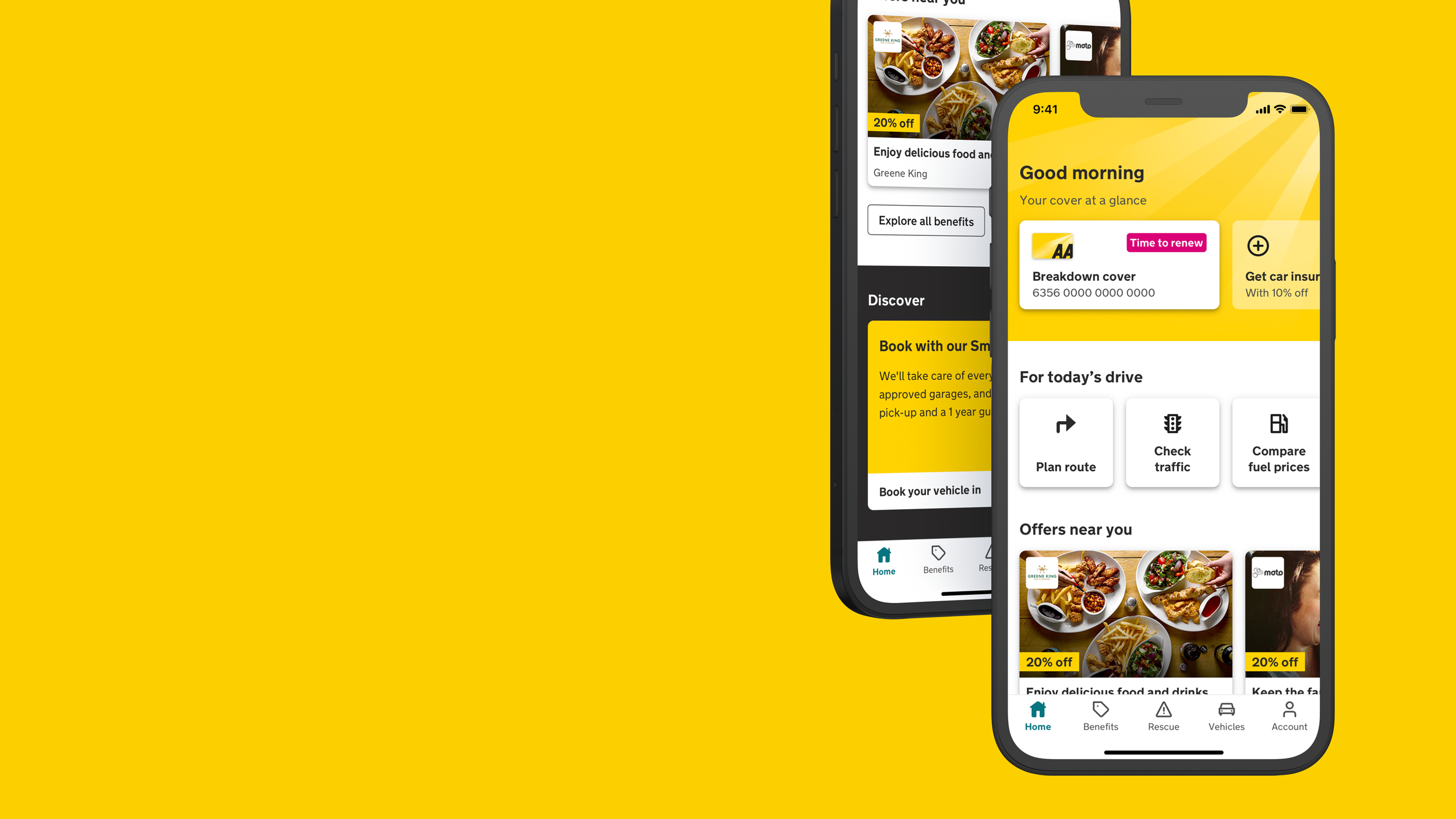
Home – Before

Vehicles – Before
The challenge
Redesigns had been started before but never realised. There was also a complex business model with different type of users, which had different type of insurances and permissions. On top of that a new backend was being developed but most of it could not be used for the redesign.
How might we do an app redesign that can be released incremental and create value for customers along the way?
Research
To help guide us and know where to start, we set out to increase task efficiency for the five key tasks in the app. The identified tasks were a mix of importance to both business and users. They were:
Report a breakdown or accident
Planning a route
Find and book a garage
Finding and redeeming member benefits
Buying insurance or breakdown cover
To identify pain points we did a heuristic review and usability testing of the top five tasks.

Setting a direction
Through cross functional ideation sessions, that I ran, we came up with ideas to the most complex pain points. As a design team we then prototyped the improvements of all the five tasks and put it to usability testing.
The findings showed we were on the right track with all tasks. This then become our direction for the design iterations going forward to work through all the details and figure out what could be released in incremental releases.
The result
A whole new home page. It went through A/B testing and was released module by module in incremental releases. Stats showed a big increase in interactions with the new compared to the old.
A quicker and easier way for customers to view their vehicles health. The new solution was more adapted to the fact that most users only have one vehicle.
A more interesting way to discover benefits.
A direction on how to continue improving the top tasks and the foundations. So that it then would be possible to truly make everyday driving life better for their customers.

After

